Principles of design with IBM Watson
Sep 8, 2017
4 min read
Principles of design with IBM Watson
I’m a design lead working with the Watson Advanced Technologies and Solutions team. I tackle projects such as designing experiences for the Watson Experience Centers, building experimental prototypes, and partnering with client organizations on strategic Watson partnerships.
During which, I’ve identified some basic tenets that can be applied when working with Watson — or any AI system and how to think through using them.
I approach designing with Watson the same as with any other product. I have to solve the user’s need which is central to success but I also have to enable human and computer cooperation — not only interaction.
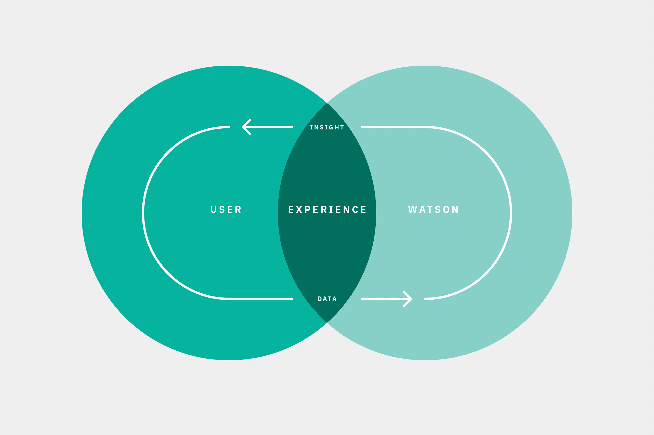
The difference when designing with Watson is to facilitate collaboration — not interactions.
The user and Watson are partners working towards mutual goals through the experience.
What insights am I trying to find, what pain point am I addressing for my user?
I apply that same thinking to Watson. Watson’s pain points and needs are usually related to data. Maybe the data I have is not enough, so I need to find additional sources to enrich it or need to call an additional API and access other contextual data to make the insight impactful. Thinking this way enables me to accommodate creativity in approaching Watson.
Designing AI experiences is not an overly complicated thing when broken down to the minimal process.
It is the same process anyone familiar with user-centric thinking combined with agile development follows. Understand my user’s needs and challenges. Craft a statement of intent, mission statement, whatever and I start developing the product with a destination in vision, design & iterate, design & iterate. The new variable is our data assumptions. Not only do I need to solve for the prior but also cozy up with the later.
Teams need to fully integrate designers, data scientists, FEDs, developers and solution architects together to solve our shortcomings.
It is no longer about designers going off playing art school and coming back at the end of the sprint with a solution.
Instead, become best friends with the dev and data scientists on the team. Engineers know the APIs like designers know grids. Build culture and trust. Keep teams lean and consistent. Put your confidence in them, and they will put theirs in you. Together you’ll guide your team to narrow your focus on achievable realities based on your current data — or a hypothesis (in data science talk *wink*).
With a grasp on my data, I can train the APIs or enrich it with additional sources. Training will increase confidence & correlation. Confidence increases usefulness & trust with your user. These create a stickier experience. This training can help your learning model discover new patterns in the data.
Move beyond the API alone.
The power of Watson APIs come to life when I enable creative and engineering teams to align these components together. Challenge teams to use some creative license in sourcing data. View the APIs as a set of building blocks and the other contextual data, information, and aesthetic as the mortar that binds it.

I need to know my user, what data I have, what I’m doing with it and, most importantly, what Watson is telling my user — don’t be confident and wrong. AI projects don’t have “normal” bugs to solve. I have to design to solve for the user’s expectations. If Watson’s confidence is low, I need to make the user aware of that. The answer will likely not correlate with what the user expects. I need to take a step back as a designer — how would I answer a question to a friend about something I don’t know: “I’m not sure how right this is but…maybe x, y, and z?” , or point the person to someone who would know. I need to design a fail state or a pivot point for to happen.
All of the data intricacies and the gaps I am addressing for my users directly correlates to how complex the solution is. The insight I am delivering, and the data I am deriving it from will drive the creative expression.

The more metaphysical the ideas, the more you have to show Watson doing.
Building a With Watson product that leverages unstructured social data to capture companies’ public sentiment is straight forward when compared to creating large-scale visualizations of Watson visually classifying movies or works of fiction.
I have to open the door, let them peek into the black box and let the user know how Watson made that decision.
The idea is similar to the concept of progressive disclosure, but we are applying it using evidence and data points. There is a cooperative aspect to these experiences I need to enable. Showing what Watson knows will help users feel confident in Watson’s decisions but also allows them to course correct or improve Watson’s knowledge at any time. Watson’s confidence, relevance, and correlation directly impact the user’s view of the system — by improving domain knowledge I can build trust.
Visualizations within the experience should address misconceptions, add to the end user outcome, and make the data easier to comprehend — visualizations are never the deliverable. The deliverable is an insight within it — but never a visualization alone. Watson is amazing when it is finding patterns and teasing those out in massive amounts of data — what we have to keep in mind is what our users need to take away — we are leading them to the needle in the noisy data haystack.
All of this distills down to 5 principles I embrace when I design with Watson.
All of this distills down to 5 principles I embrace when I design with Watson.
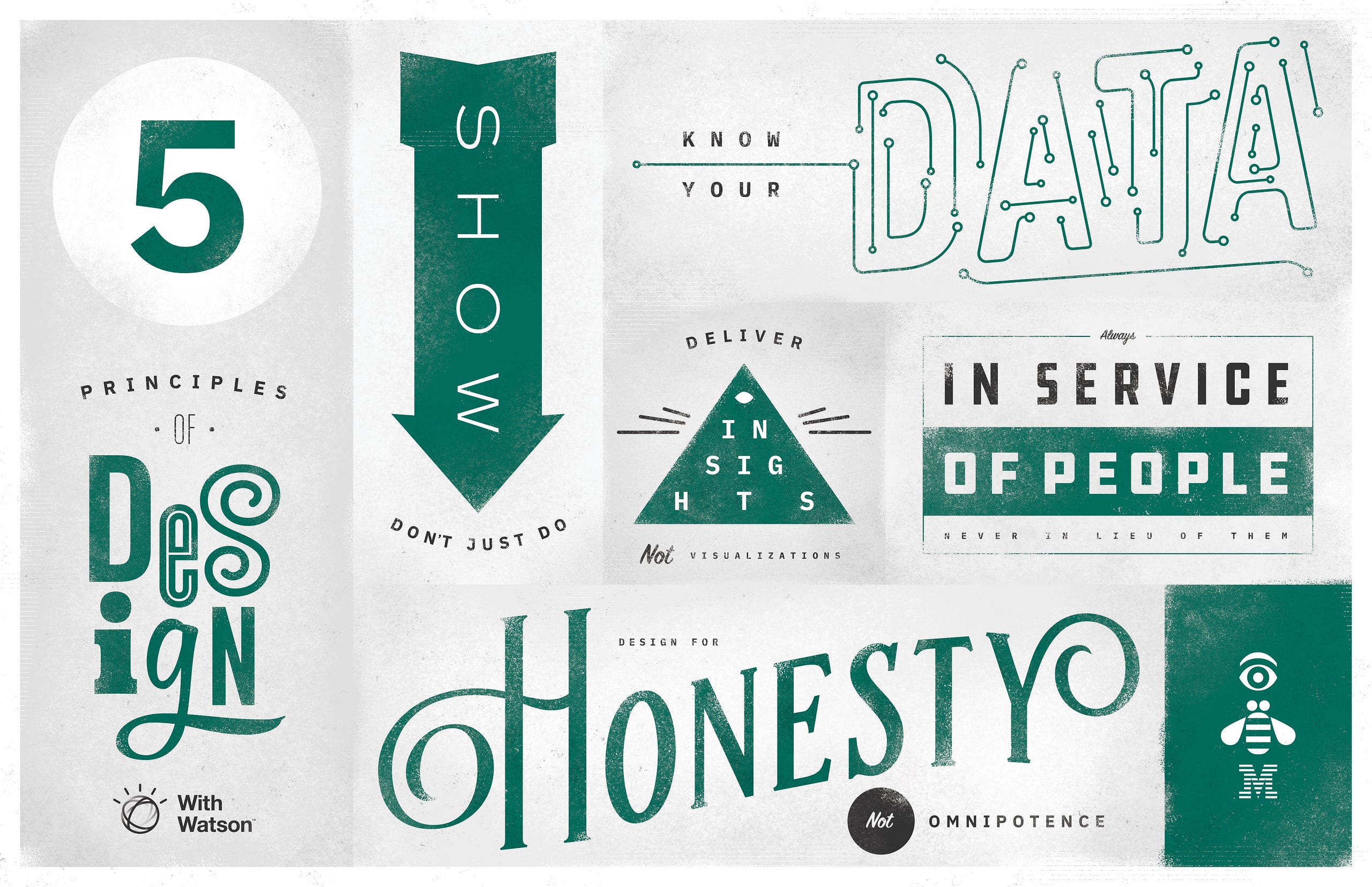
No 1. Know your data.
No 2. Design for honesty, not omnipotence.
No 3. Show — don’t just do.
No 4. Deliver insights, not visualizations.
No 5. In service of people never in lieu of them.
—
This private publication is not affiliated with my employers or professional associations. Personal blog, personal opinions. Not speaking for anyone but myself. ✌️
Back
←
