Wading through the flotsam and jetsam
May 11, 2020
8 min read
Earlier this year, I was accepted as a mentor in AIGA NY’s Mentoring program — I’m partnered with a few designers, and I get the unique opportunity to chat with them 1-on-1 and try my best to help them grow as creatives and navigate their careers.
A topic that came up during one of our calls was how to present creative work. I said, “Hey — I got tons of old presentations and stuff — I’ll create a folder for you to dig through.” While I was digging, I was absolutely amazed at some of the stuff that didn’t see the light of day.
That’s where the title comes from. Lagan in Maritime speak is goods that have been cast overboard but marked in ownership by a buoy or marker. Despite being marked only by a float, the owner has the right to return and collect those goods later. So while navigating through the flotsam and jetsam of my old work, I found these buoys hoarded away on drives.
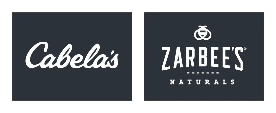
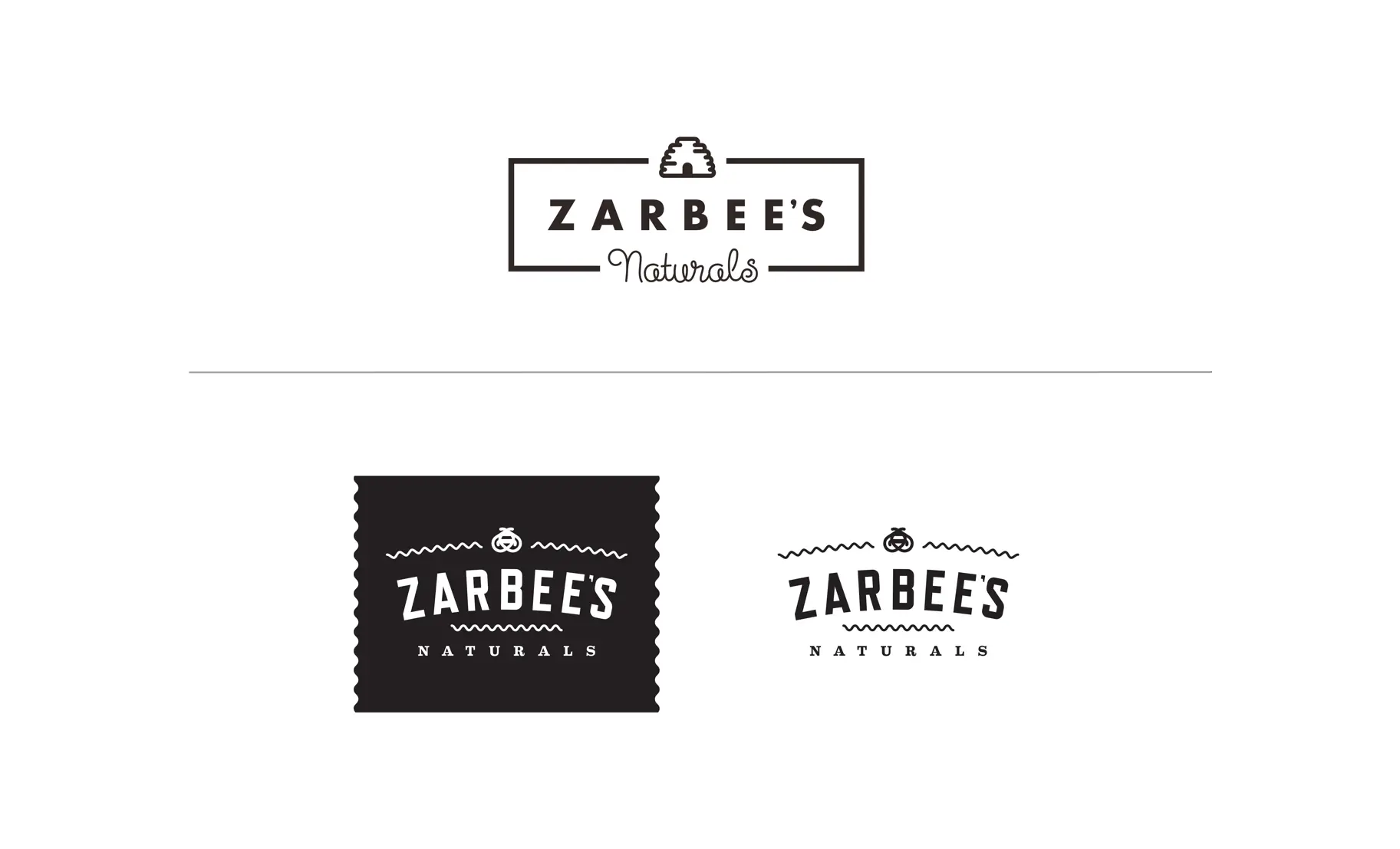
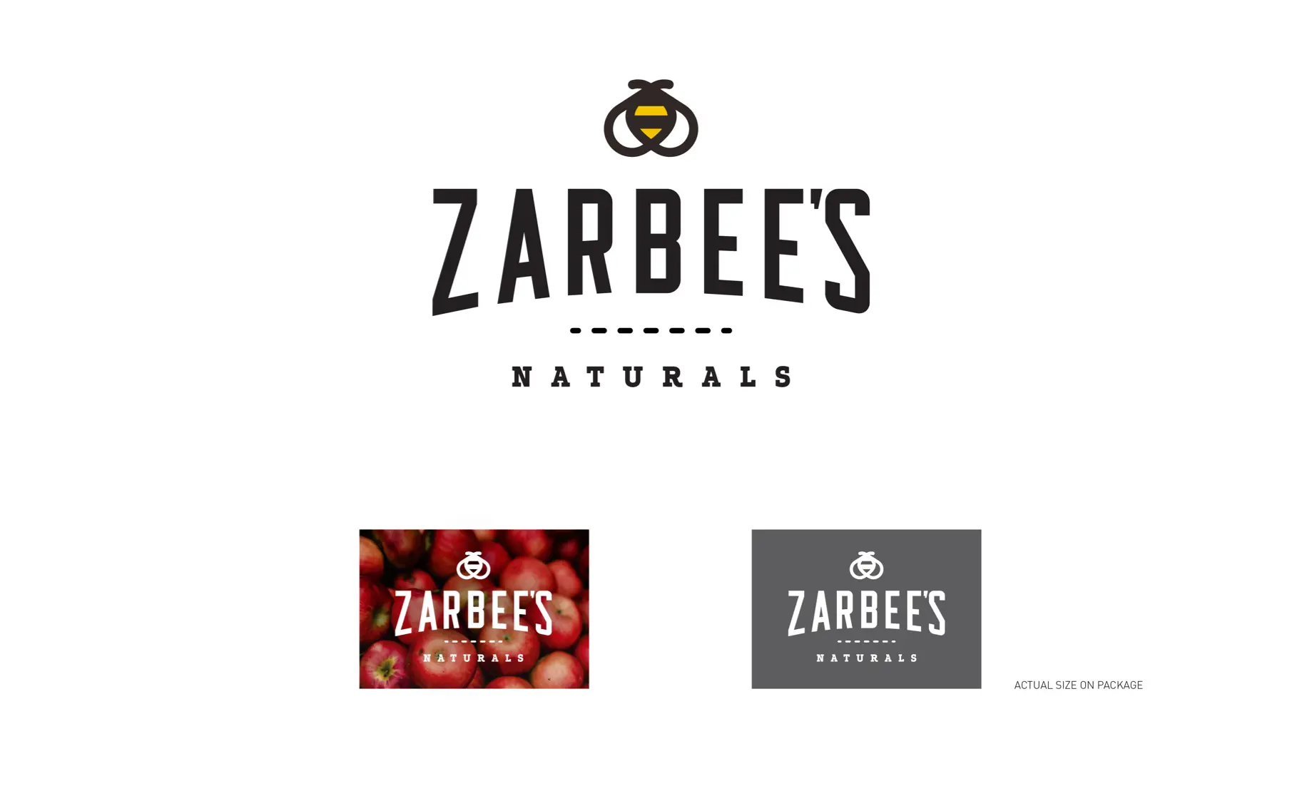
Two projects stuck out the most — the Cabela’s rebrand and the Zarbee’s Naturals rebrand. I chose to focus on Zarbee’s for two reasons. First, this was my last big project before leaving Ogilvy, and I got the opportunity to lead the creative execution outright. Secondly, it was my first and only work to get featured on Brand New.
I love Brand New — to this day, it’s my daily go-to site for design and brand goodies. Armin does a great job critiquing work without veering too hard into hot takes territory. The comments, on the other hand, often verge on the level of fantasy. No design happens in a vacuum.
The Zarbee’s pitch
I remember the pitch being tight from a churn standpoint — worked very closely with the strategy team. I was given a lot of creative rope regarding the pitch — which was really fun. We were pitching large rebrands at the time by making real books — we made a fucking book.
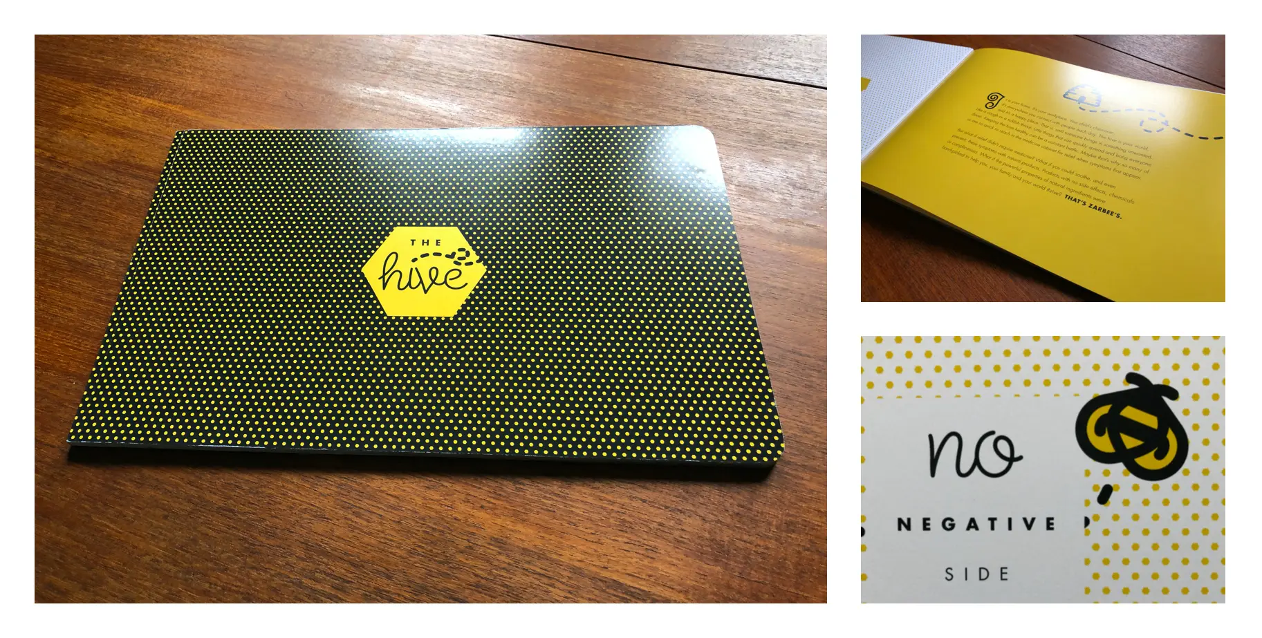
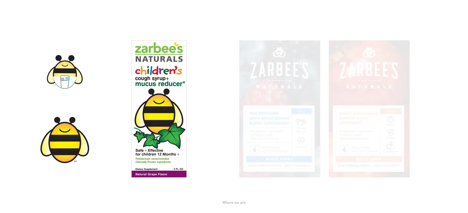
There were so many amazing little details in the pitch that ended up making it throughout the entirety of the project. From my thicc bee, I drew in a notebook and digitized to the details and tone. I’m still very proud of how the pitch turned out and even prouder because we won it.
Growing pains
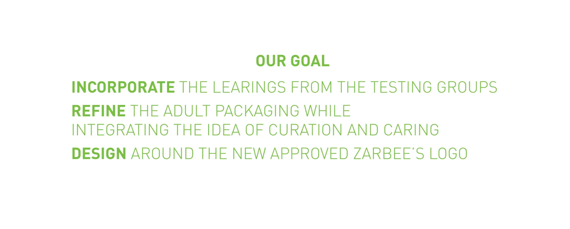
Zarbee’s at the time was quickly evolving and growing. There is never a “good” time to redesign a brand — it takes years for it to effectively trickle throughout executions. Fortunately — Zarbee’s planned the rebrand as part of their push for a more extensive market base. But to meet new product launches, the logo and identity had to be explored in lockstep with their new Adult product launch. In other words — we had to make a TON of work fast.
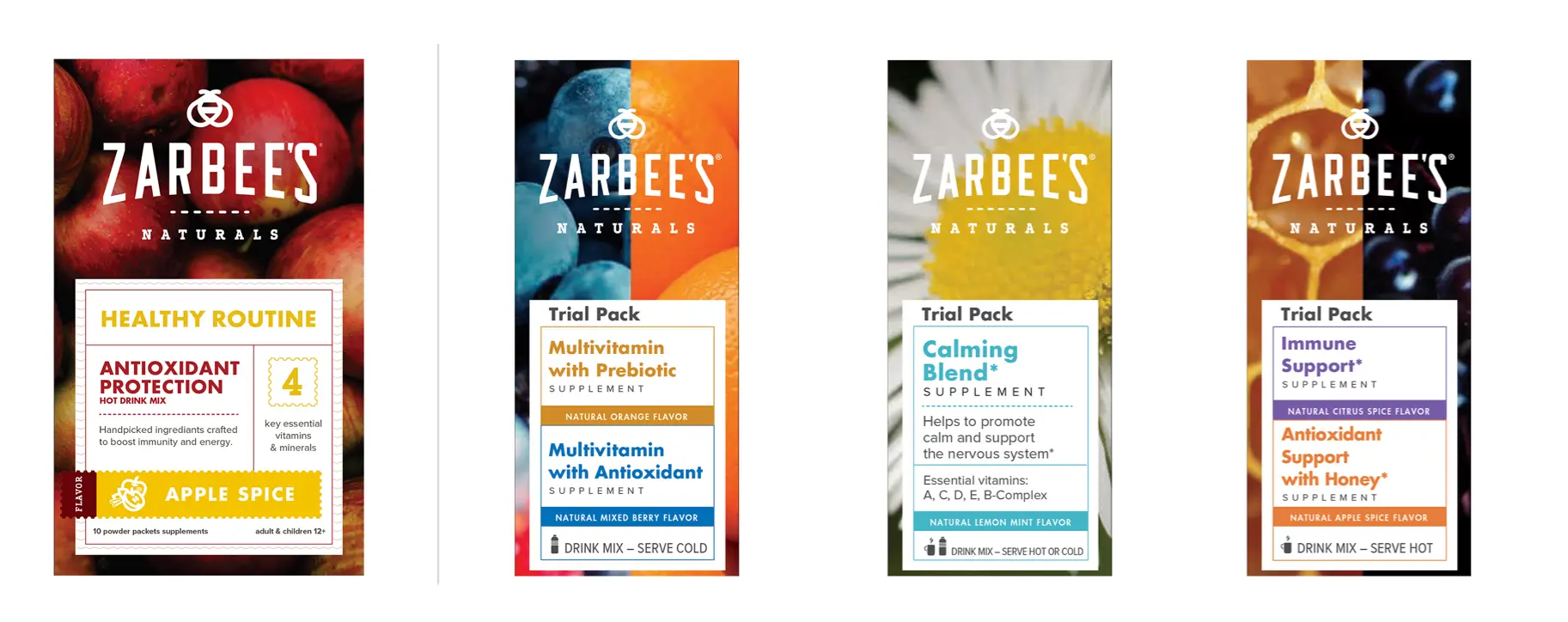
In efforts to keep this as linear as possible — I’m going to show product work that features numerous marks that were evolving as the logo design work ran parallel. The first project we tackled was not actually the logo redesign but was packaging their Adult product due to production timelines. We were creating initial designs almost 2 months before we presented logo concepts — not an ideal workflow, but it was the reality.
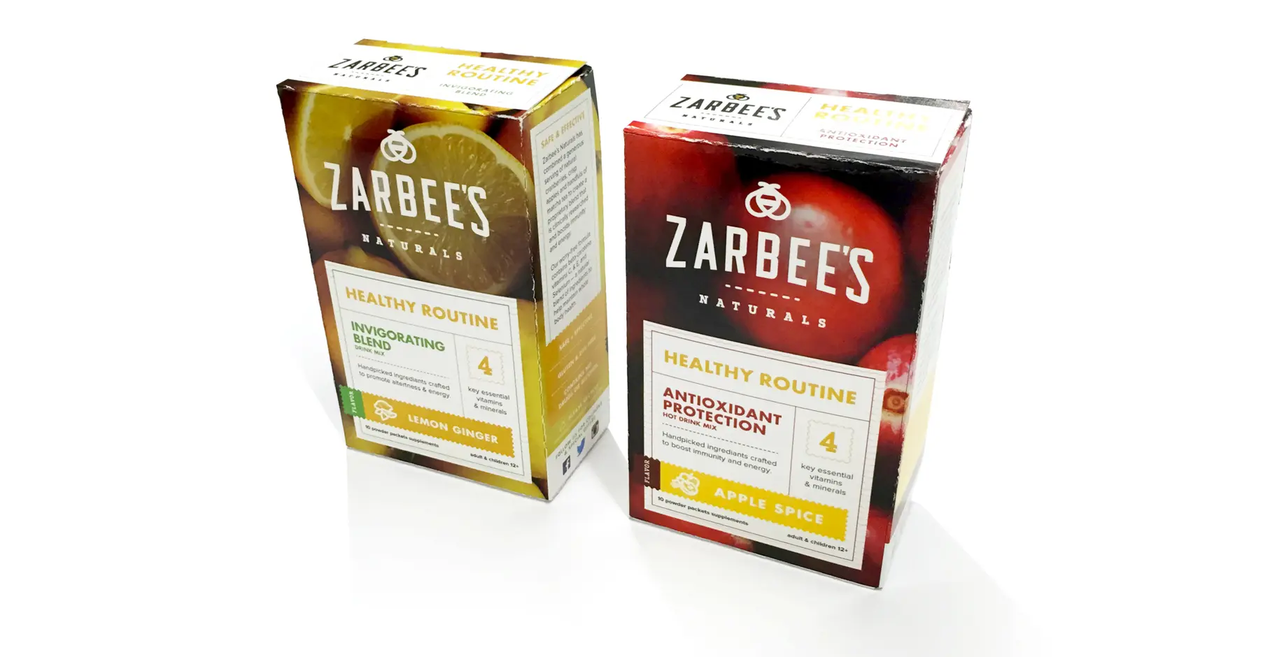
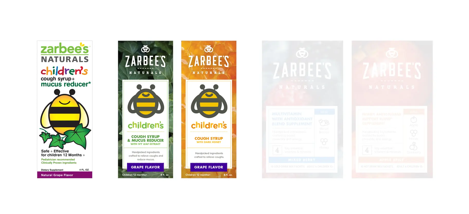
The first round of packaging featured the in-process brand we created for the initial pitch. There is a lot of design work in the executions that evolved and found its way to the brand guidelines. The bee’s flight path, using the bee to weave among planes on the packaging, and the details in the typography. There is even more that didn’t.
This work ended up being a bit too aspirational for the brand. We would continue to explore this packaging for another six rounds — SIX. We ended up stepping into the middle space between rebrand and brand evolution. A less-than-ideal design pastiche that features a smattering of aesthetics and languages.
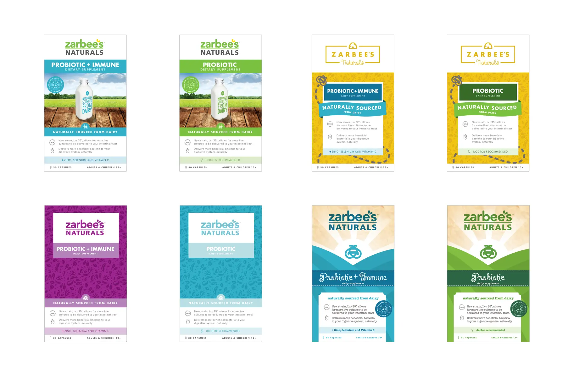
Look how utterly atrocious that last two are. SHUDDERS.
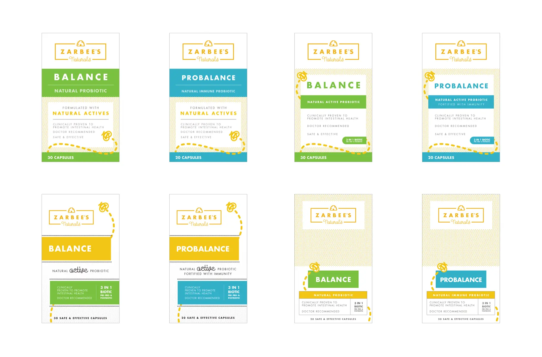
In the end, the entire probiotics product line was canceled, which freed me to focus on the logo design solely. Fortunately, much of the design exploration would become part of the final brand and packaging design guidance.
Creating a buzz
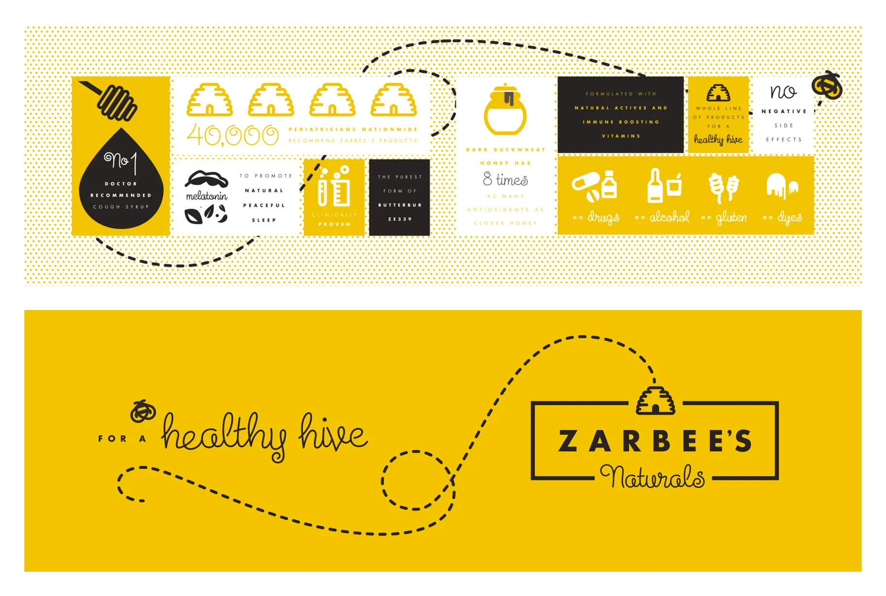
The brand positioning in the initial client pitch — hand curation, trust, and natural products served as the strategic framework for directions explored. Working closely with our strategy leads, we framed them as Modern Apothecary, Ingredients, and Curation.
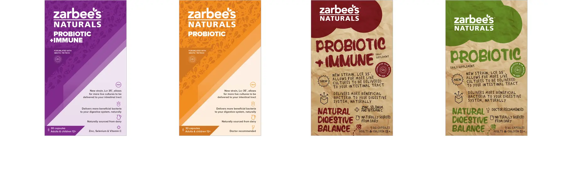
Modern Apothecary
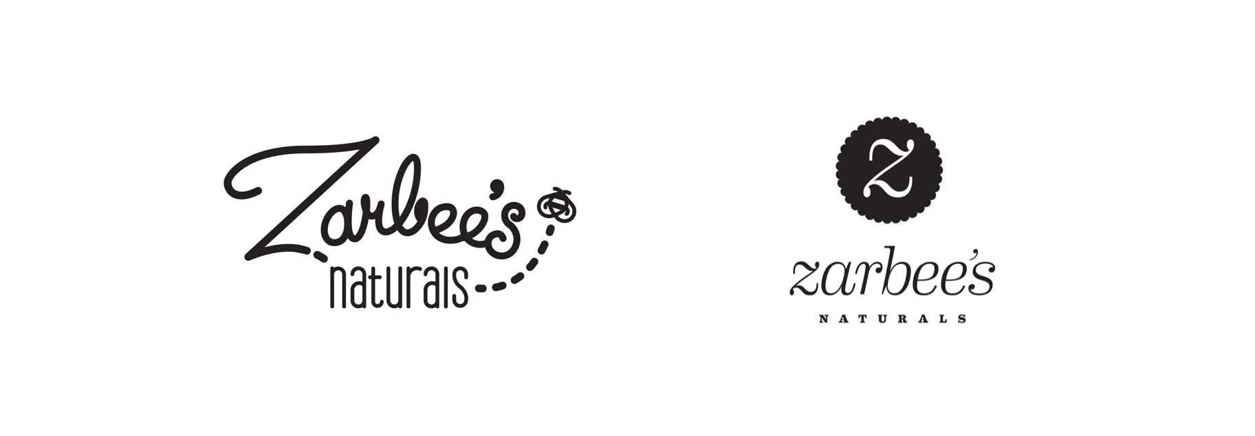
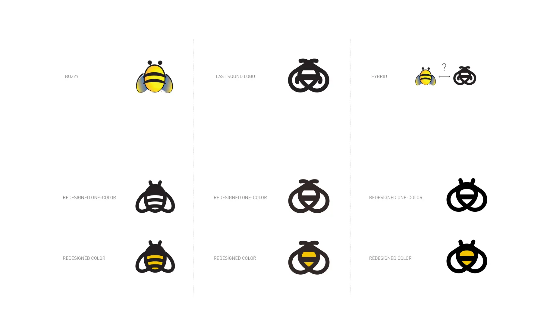
I started with the pitch logo and expanded outward. I still have a ton of heart for the Steinweiss script in this option, but it did not reinforce the bee of Zarbee’s enough. We took the chubby bee from the initial pitch and created visual lockups with different variations of type. Some of these are more successful than others. The presentation I have is the non-proofread — beware typos ahead.
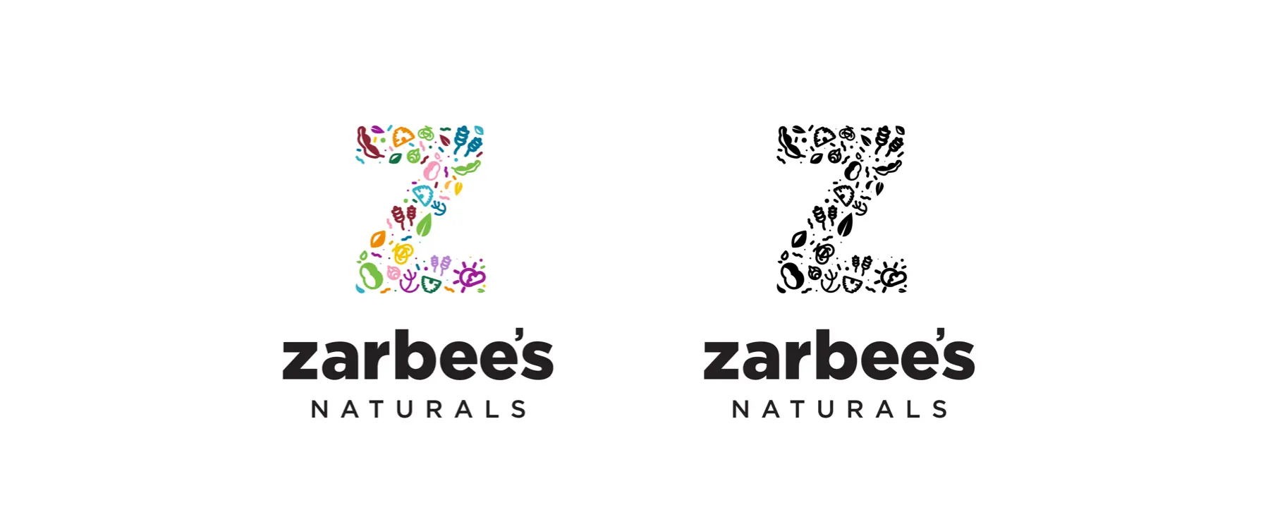
Ingredients
A direction I explored a lot and had some strong feeling for was the ingredient illustrations. These first appeared a few months back during our initial exploration of the probiotics product and went back to the concept to create a direction that still feels very strong for me.
Refining the brand
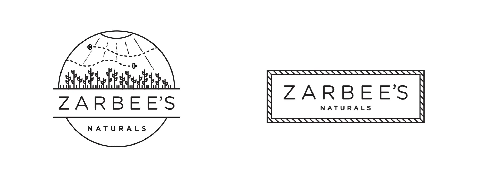
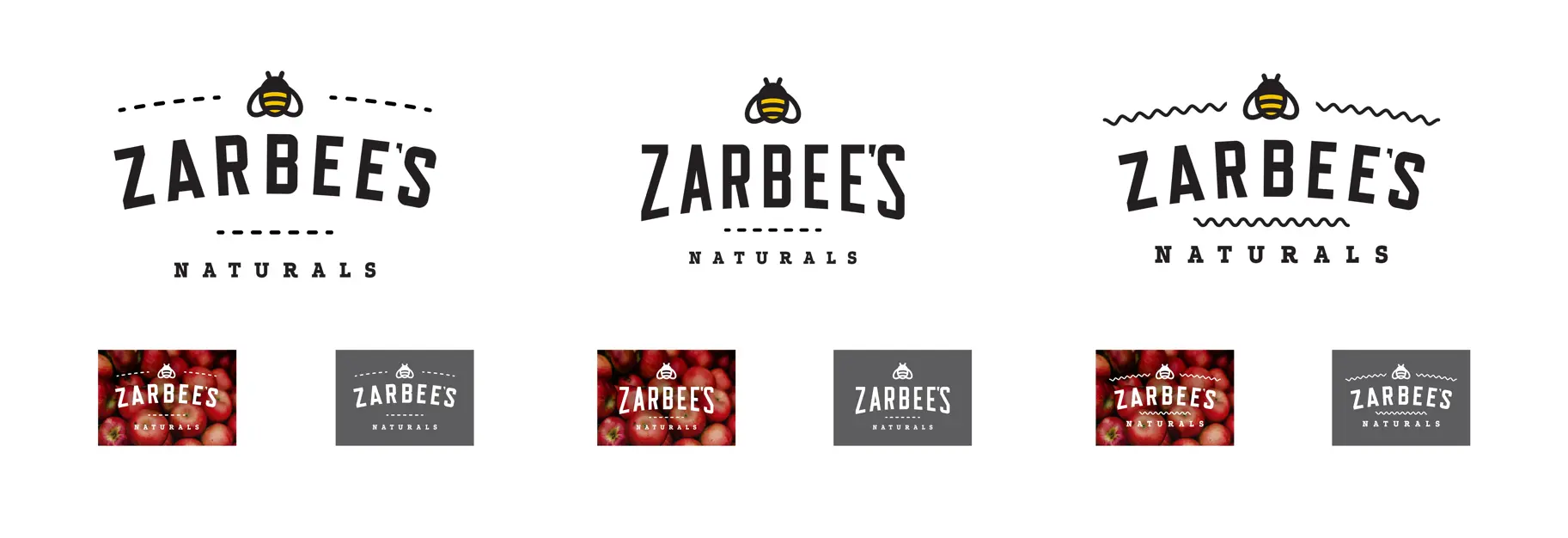
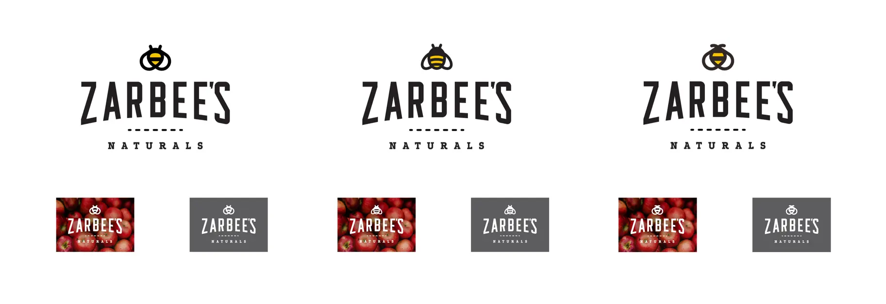
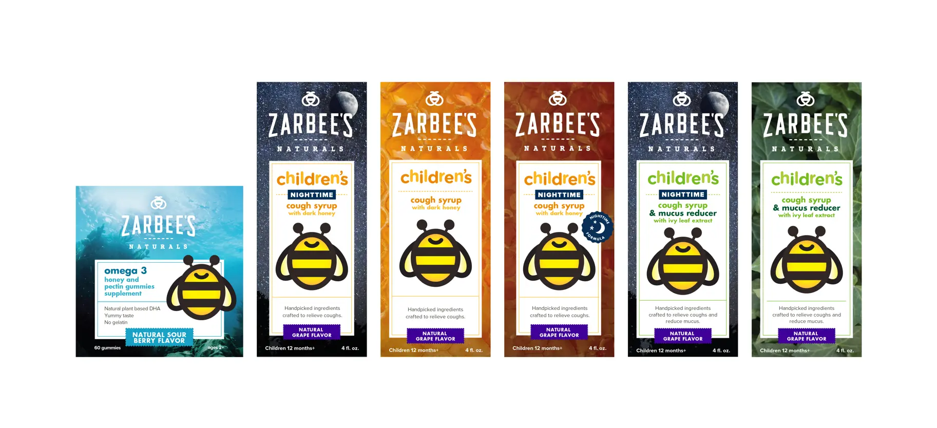
By the 5th round of design iterations, the brand and direction started to coalesce. One of my favorite things is seeing how the bee evolved and feeling that we ended going in the strongest visual direction — a rare occurrence in my experience.
Pollinating the Aisle
One of the most creative challenges and, ultimately, disappointing experiences of the redesign was the packaging. While the logo design was reaching its final rounds, I started working with a larger group of great designers to create testing materials for focus groups: Gina Maniscalco, Kelsey Plantas, and Erica Firestone.
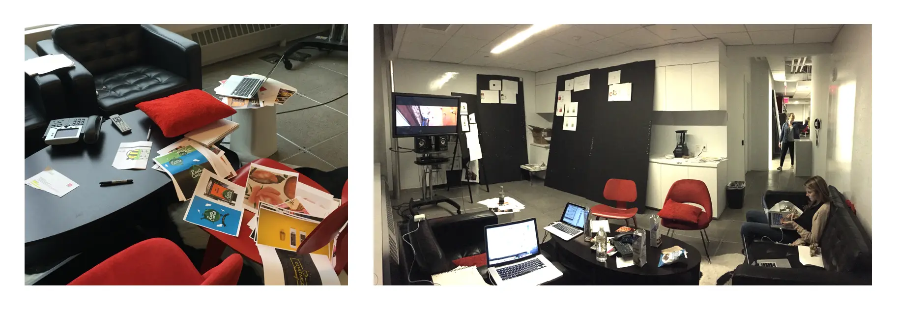
Qualitative packaging testing was one of the most exhausting things I’ve ever done. We’d crank through any number of directions and hand them off to the strategy team to then focus group with consumers. We’d then wash and repeat that process the next day — constantly iterating and reacting to the feedback and pivoting in real-time. Some of the timestamps on my file naming convention are 11:46 PM. It was a grind. We set up a war room in the back area of our floor — watched The Royal Tenenbaums and cranked out work.
We ultimately ended up with the branding and a packaging direction that we all felt was strongest and closest aligned to the initial pitch direction and was now reinforced through customer testing.
Crafting a new direction
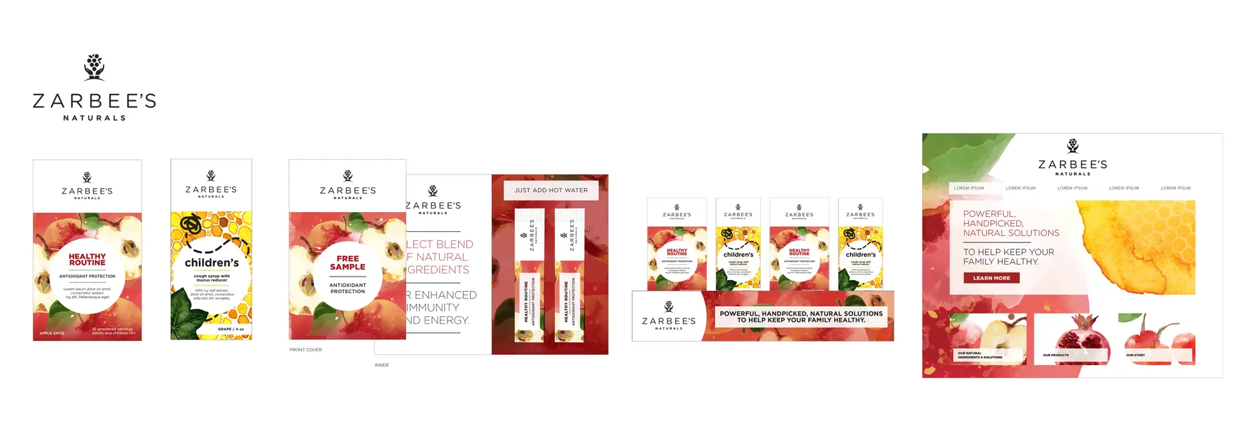
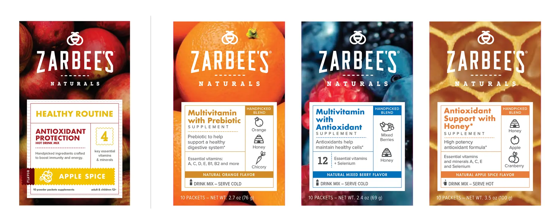
We finally had a direction we could iterate that would not pivot, and I really dove in the deep end on the packaging. The entire design theory hung on the beauty of nature’s ingredients balanced with what we were calling modern apothecary. Think Kiehl’s inspired with more focus on imagery. All of this would be anchored around the bold new mark.
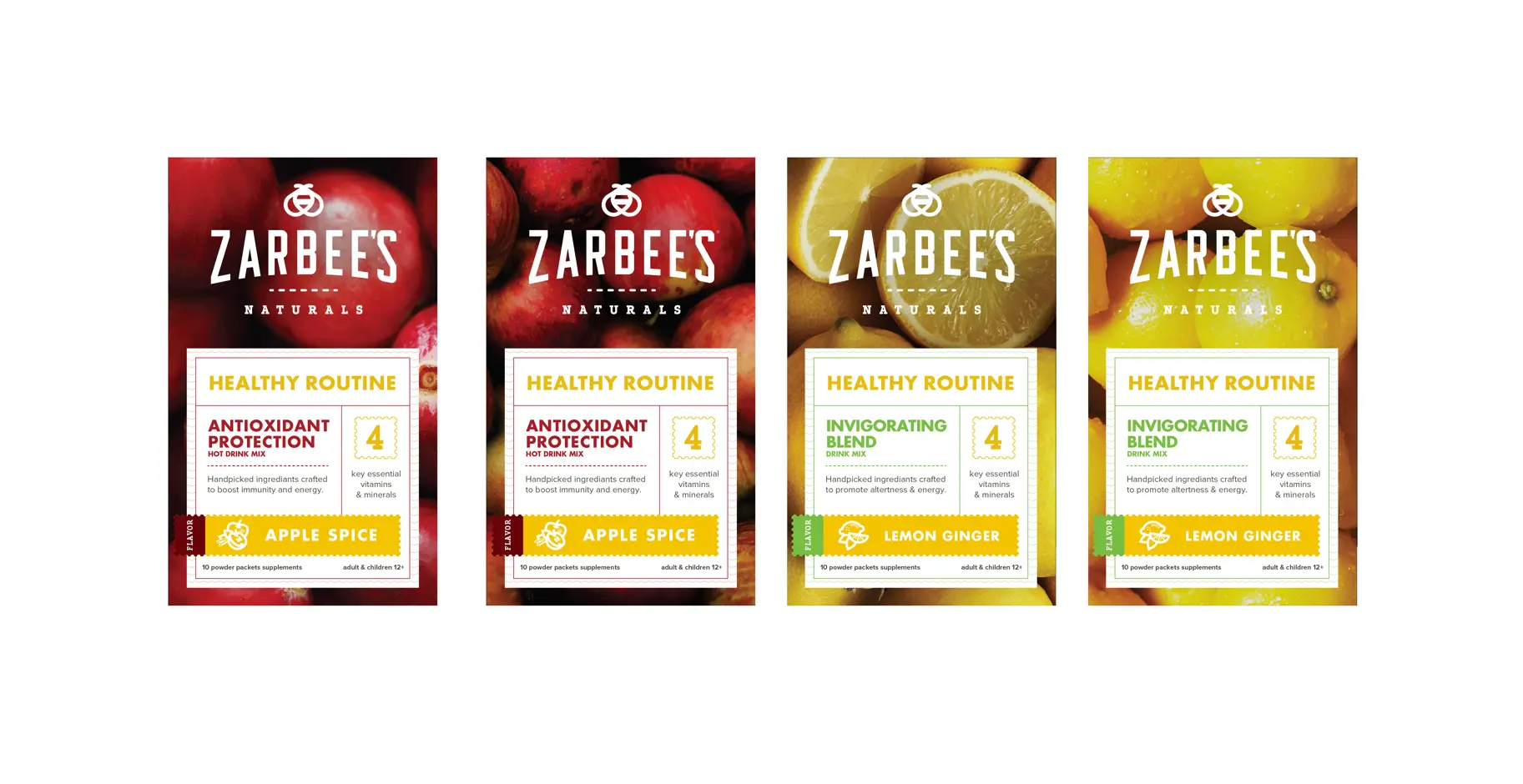
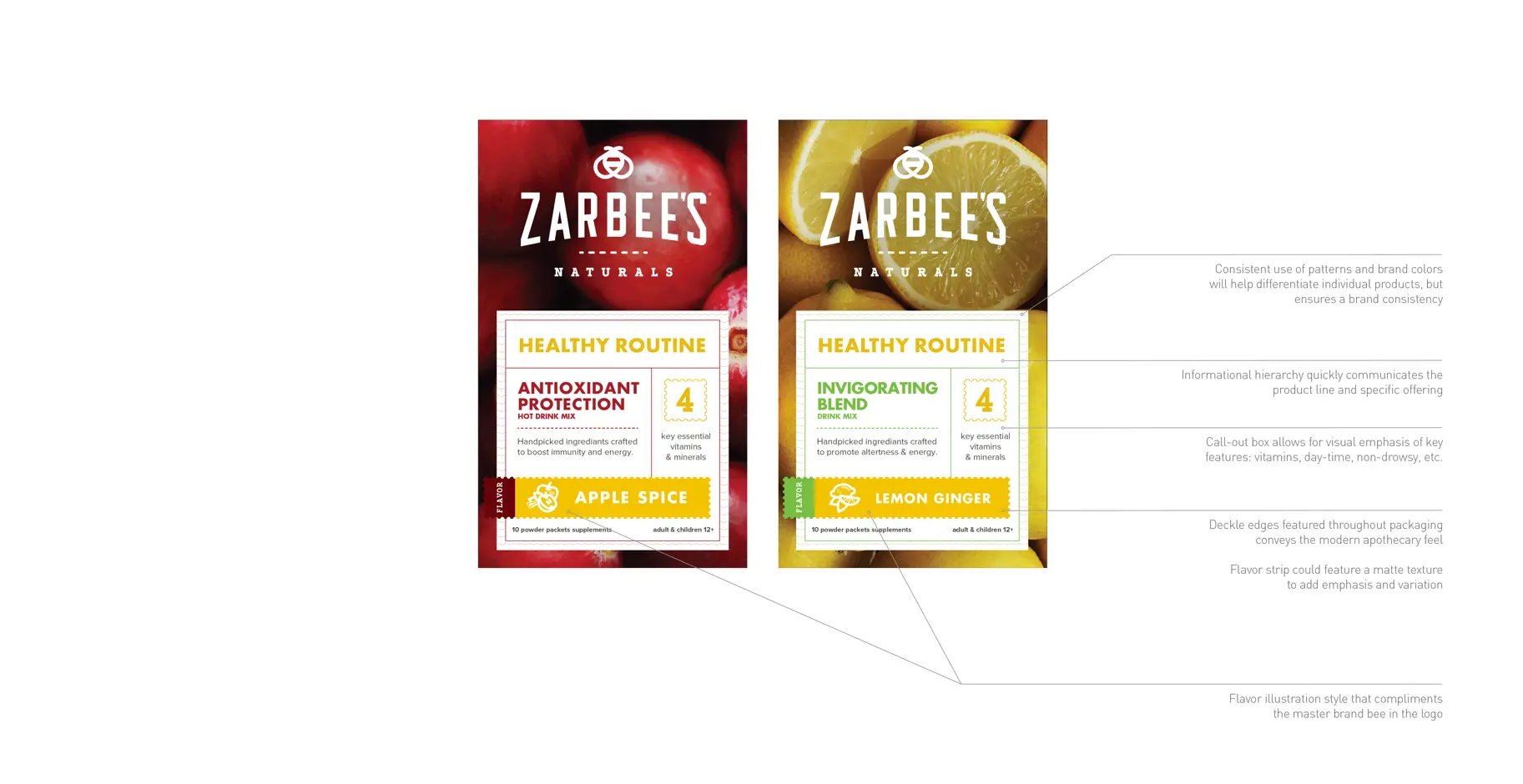
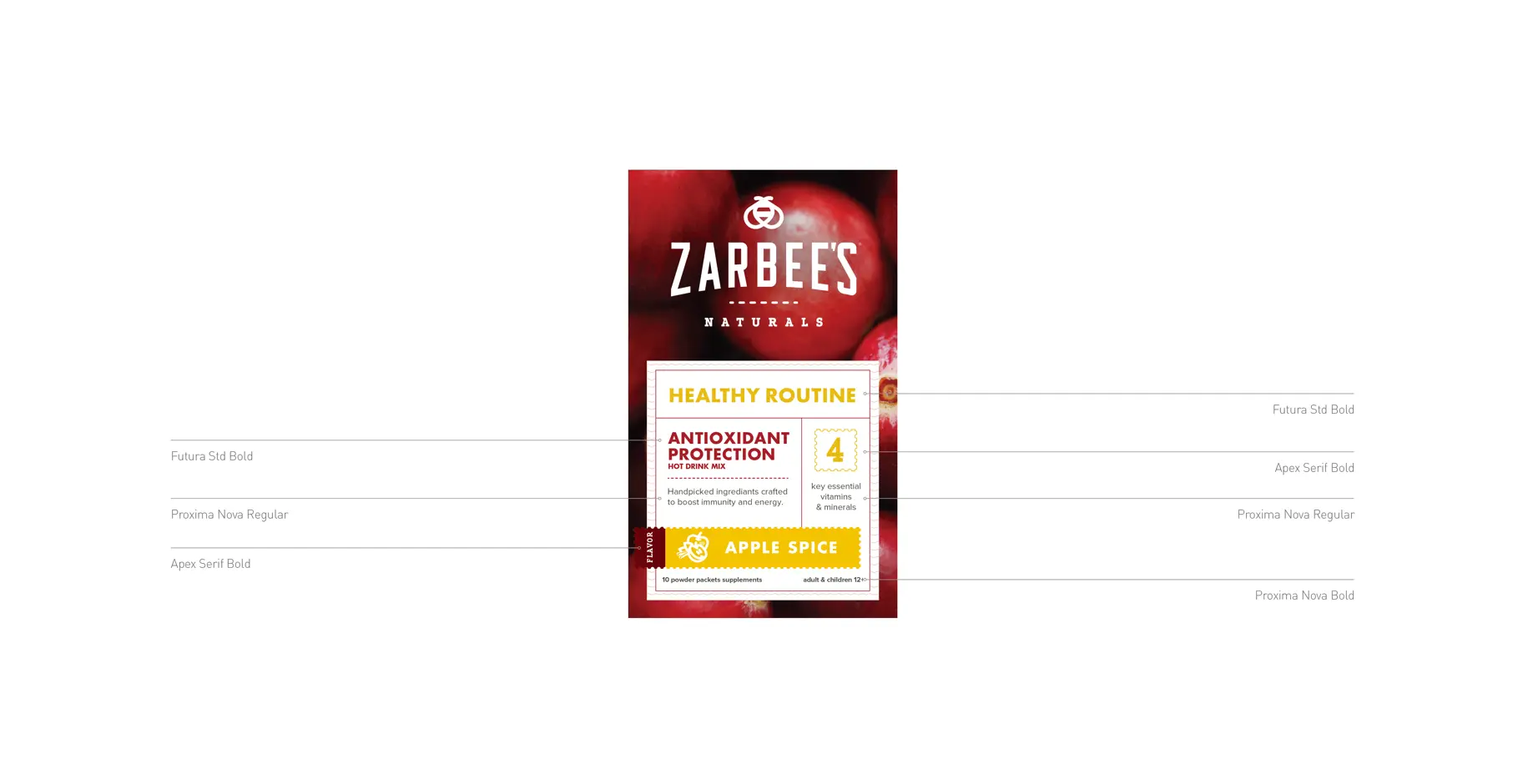
I was consumed with the packaging — I was sweating illustrations, colors, patterns — working to create a cohesive language. I was calling out paper finishes — matte vs. gloss — really enjoying this process, and I was excited it would be in Target where my family could see it. Unfortunately, my role in the packaging was only that of an advisor. Since I was leading the brand design — I was creating the guidance and guidelines — not executing the creative.
Losing control
As we handed over design guidance to the delivery agency — I, fortunately, can’t even remember who it was — I quickly saw we were losing the craft and execution details I spent so long poring myself over. As I focused on designing the children’s packaging, the delivery agency started sending us packaging to “match” to. Despite my increasing reticence about the craft of the work — I focused on my tasks. Evolving the baby and kid bee to align closer with our new adult bee and adapting our design language for the children’s packaging.
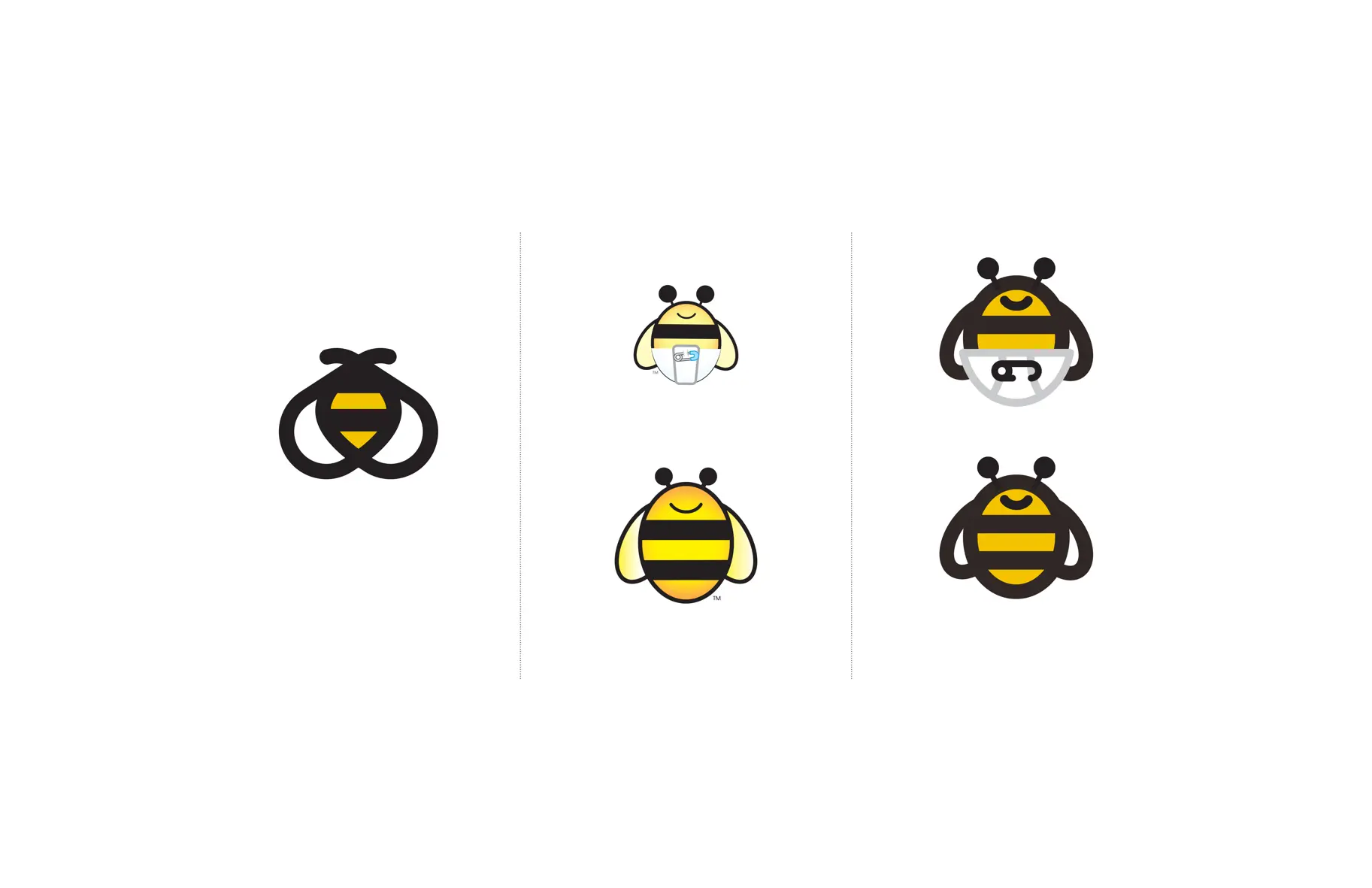
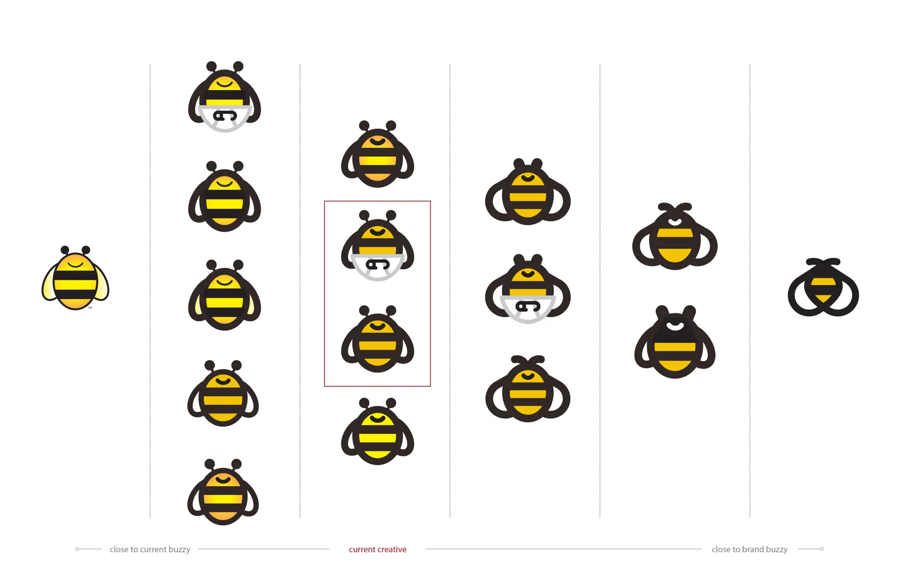
I spent so much time drawing and redrawing our chubby bee and their current bee to try to find a happy medium. I personally adore the 4th column from the left. I also love that chubby diaper. So cute.
Unfortunately, we’d lose that battle.
We’d also lose the battle on the Children’s and Baby front. This was Zarbee’s primary market — naturally, they had reservations about alienating their customer base and losing market share. This was a sound business decision that didn’t track with the work, but as the client was theirs to make. Even their packaging nowadays still has a striking resemblance to the packaging we started out with supplied by the client. I’ve ghosted some work I did not execute.
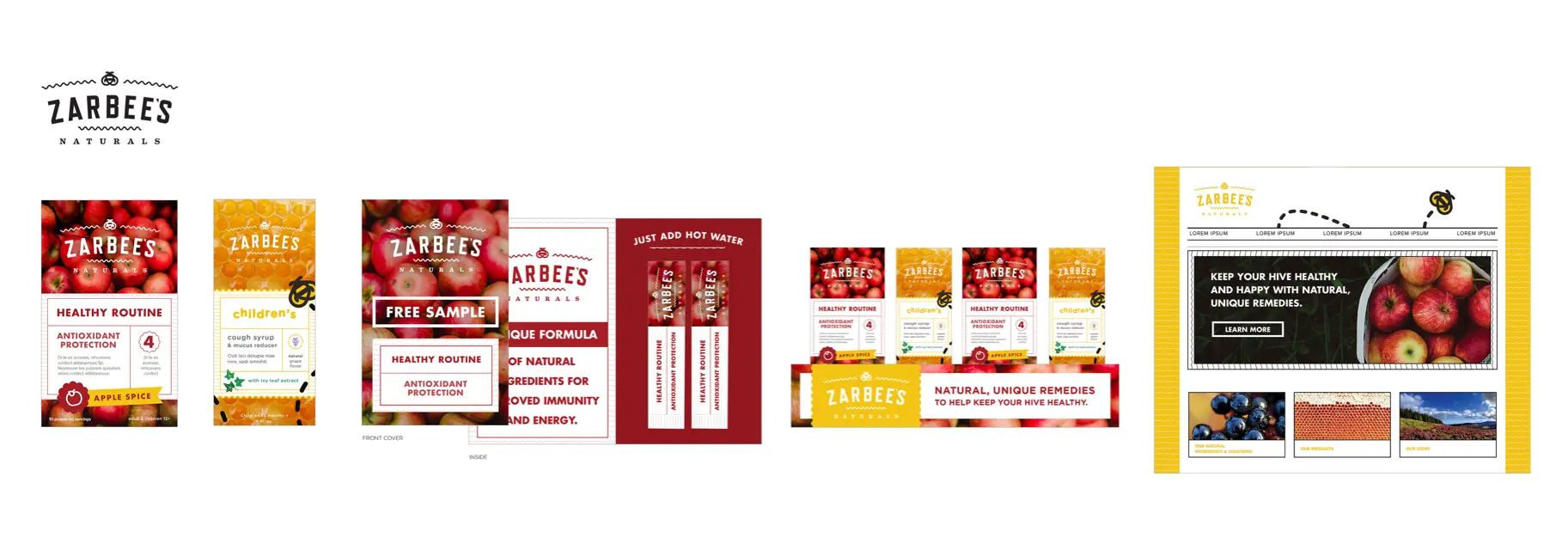
The packaging agency continued to evolve the work. The photography took a step down — I know there was a meeting about costs and rights-managed photography we were using in our comps from Offset and the royalty-free imagery they were sourcing from — where ever. The visual finesse and attention to detail turned to templates and speed.

Our supplied packaging design on the left, production packaging on the right
This is not meant to sound bitter — not dragging anyone here — but just illustrating how these things evolve beyond your control as a lead creative. I resigned myself to the fact that these influences were out of my direct supervision and focused solely on wrapping up the design guidelines. Our contract was quickly running out with the client, and we needed to deliver the brand guidelines in February.
I wrapped up the work on the design guidelines. There is a ton of great work in there. I’m linking to them as is — I removed some personal identifying information from the brand contacts page but is essentially unchanged.
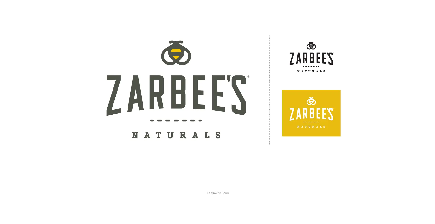
Brand New start
It took a few more months for the rebrand to hit the market — by this time, I had moved on from Ogilvy. I was over at IBM evolving into my truest Pokemon nerd form — which I’m still doing. One day I fired up Brand New and saw my chubby bee staring back at me.
Shit. I. Was. Pumped.
I love that fat little bee so much I was so excited to see it make an appearance. Armin seemed generally positive on the work and reinforced my own critiques with it. Then I saw the packaging shots, and I’m sure I groaned fuck at the office too loudly.
The visual representations of all the time and effort were just the packaging. Fortunately — all the comments aligned with my critiques and even sniffed out some of the problems we encountered. Every hurdle and challenge we faced was expressed in the comments.
I’m still proud as hell of the project. I feel like I made my bones on this one. I also got to lead the work and find my own voice carrying more influence with the client than our own Executive team. The mark still holds up and has survived one acquisition. Who knows what the world holds for my little bee. I also genuinely have affection for the brand — I love their honey throat drops and some interesting work has happened as the brand has taken on a life of its own — I’m a big fan of the bee patterns they are featuring on their packaging now.
It was no one person show though — as I mentioned before — during the grind times, I had a crew of excellent designers to work with: Gina Maniscalco, Kelsey Plantas, and Erica Firestone. Had a fantastic account executive — who weathered my own mania like a pro — Kristin Paulus. The client team who did champion and push the work as much as they could — there are sometimes influences even they can’t control. And the strategy work which was led by Dash Alison who is now Strategy Director at COLLINS.
I hope seeing how this Zarbee’s evolved can help other creatives think about how they steward projects and help designers and folks on the interwebs to realize design doesn’t happen in a vacuum — ever.
—
This private publication is not affiliated with my employers or professional associations. Personal blog, personal opinions. Not speaking for anyone but myself. ✌️
Back
←
